


Before and After: Converting a 1973 Whistler Ski Cabin into a Family Home
The right angles make all the difference in this revamp of a Whistler cabin by Stark Architecture.
The shortest distance between two points may be a straight line, but the far more interesting path comes with a slant. It’s certainly evident in the renovation of a 1973 ski cabin in Whistler, its angles and idiosyncrasies retained and reimagined into an unexpected hybrid of old and new by Stark Architecture. It’s also become an unofficial dictum of the firm:
On his first visit to the site, in a hilly neighbourhood northwest of Whistler Village, Arnott knew that, despite being “a rundown, nasty cabin,” he wanted to work with it.
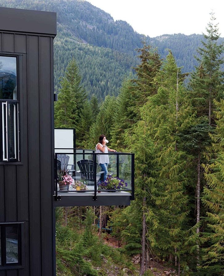
He also saw that the property had ample room for an extension that could take advantage of the east/west views (in this ski town, It’s all about the peaks of Whistler, Blackcomb, Wedge, Black Tusk), and an interplay began between that funky cabin and a new modern structure perpendicular to it.
The new homeowners, full-time Whistler residents Michelle and Mark Forster (known as Mitch and Foz), also knew a straightforward renovation wasn’t going to work for them. The temptation was to tear down and start fresh, but Arnott’s rather out-of-the-box approach gelled with the couple. They share similarly far-flung backgrounds–Arnott came to Vancouver from Scotland by way of Sweden, while Mitch, an Aussie, and Foz, a Brit, met and fell in love in Whistler before moving to Australia and then back here permanently. When they first met, Foz gave Arnott a stack of skater and surfer magazines. They hit it off.
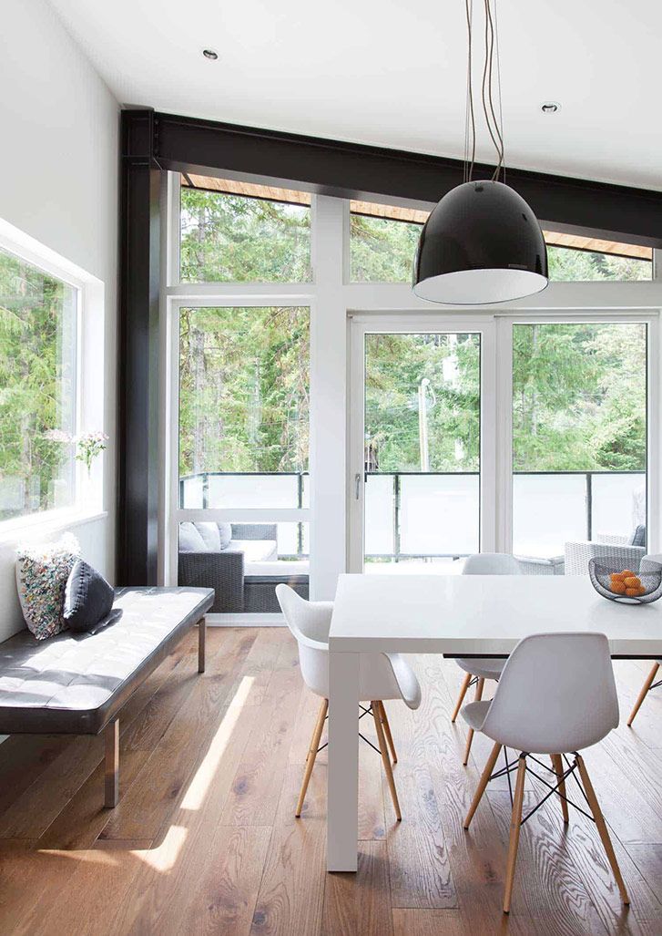
The trio began a collaboration – reno and construction project, that resulted in a break-the-mould four-bedroom house ( 3,800 square feet, including rental suite). The couple’s number-one must-have was an expansive entertaining area with central kitchen, because “everyone always ends up in the kitchen, regardless of how big the rest of your house is,” says Mitch. This became the core of the addition–a long and open floor plan that flows into a dining room at one end and sunken lounge at the other.
Punctuating this stretched-out great room are dramatic black-steel beams. Structural in a space that’s otherwise devoid of interior walls, they also break up the all-white airiness and frame the views on either end. And they have an environmental function. By moving the beams to the inside of the building envelope, fast-conducting steel is isolated from exterior temperatures and becomes more energy-efficient.
The beams also make a connection to the original cabin’s exposed timber, now painted black to match the steel. Dating from an era in which old-growth wood was common in construction, it was another reason to salvage the cabin, along with the sloping, not-quite-A-frame shape that everyone except for Arnott was initially inclined to flatten out. Its slant was even highlighted with cladding–standing-seam metal in jet black, inside and out.
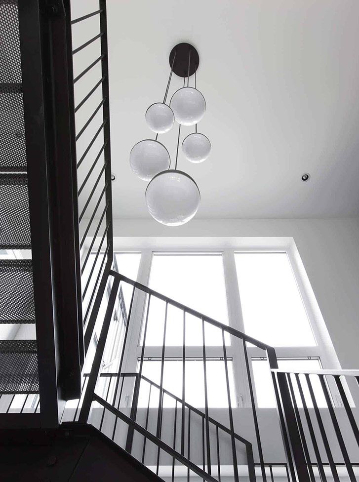
All this adds to the industrial look that Mitch and Foz wanted. Black pops, like bold Flos lighting and an Eames lounge chair, are set against stark white throughout, including a whitewashed brick wall that the couple installed themselves, brick by brick. The whole vibe is of a converted warehouse loft –”ideal for the couple’s art collection (a new piece added every wedding anniversary).
“As we progressed, it was easy to see how we could tie in the old with the new,” says Mitch, whether that meant painting old wood the same black as new steel beams or embracing those offbeat sloped walls. Another palpable link is, quite literally, the bridge on the second floor.
And It’s not the straight-and-easy route. Arnott refers to a chef adage about it being easy to create something out of great ingredients; the challenge is in doing the same with not-so-great elements. Here, in this architectural framework, wonky walls and old-school-cabin clichés are reassembled and transformed into something that’s pitch-perfect.